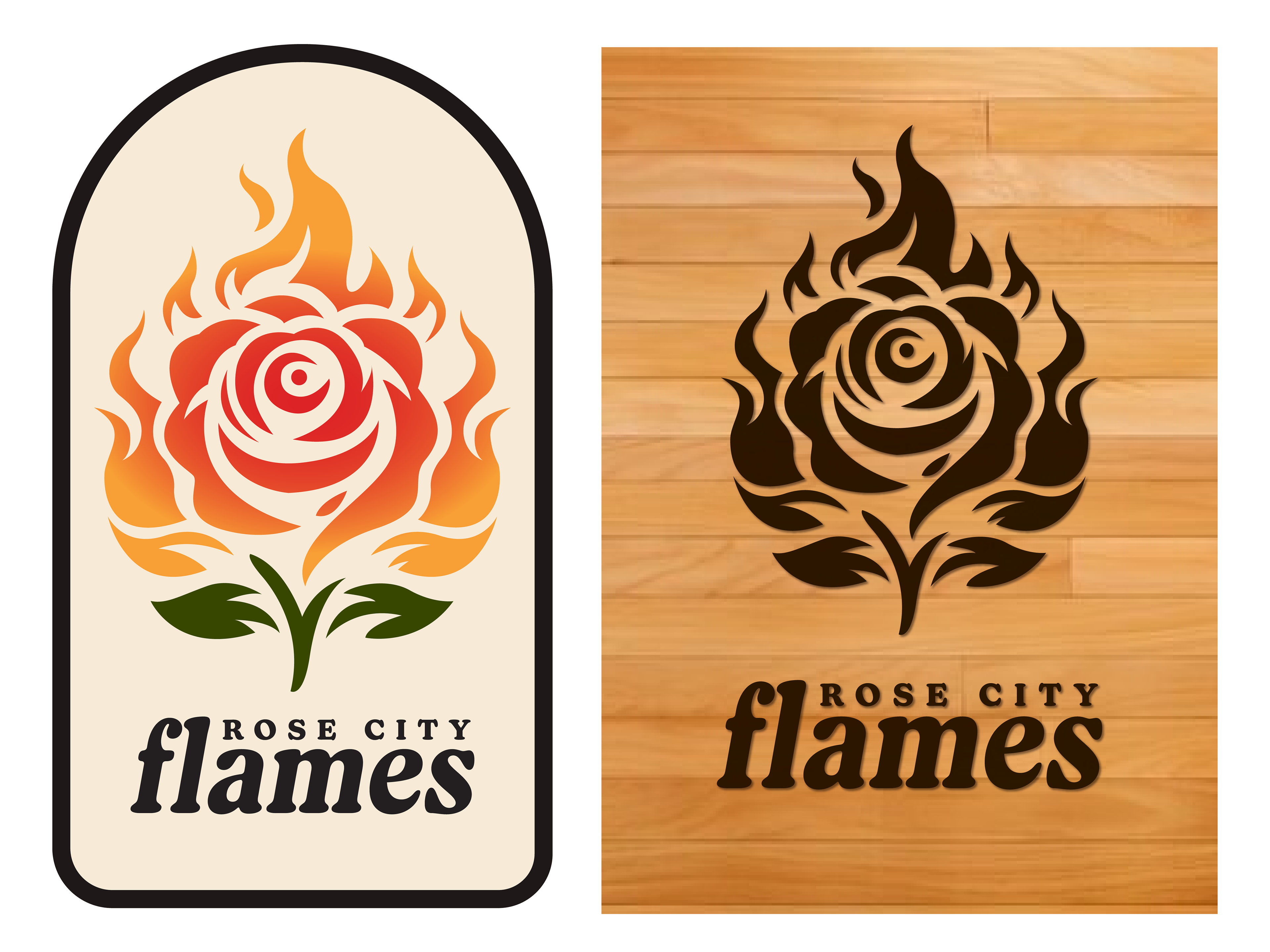
Branded a conceptual Portland basketball team, creating a bold identity system and merchandise-ready visuals that capture team spirit and local pride.
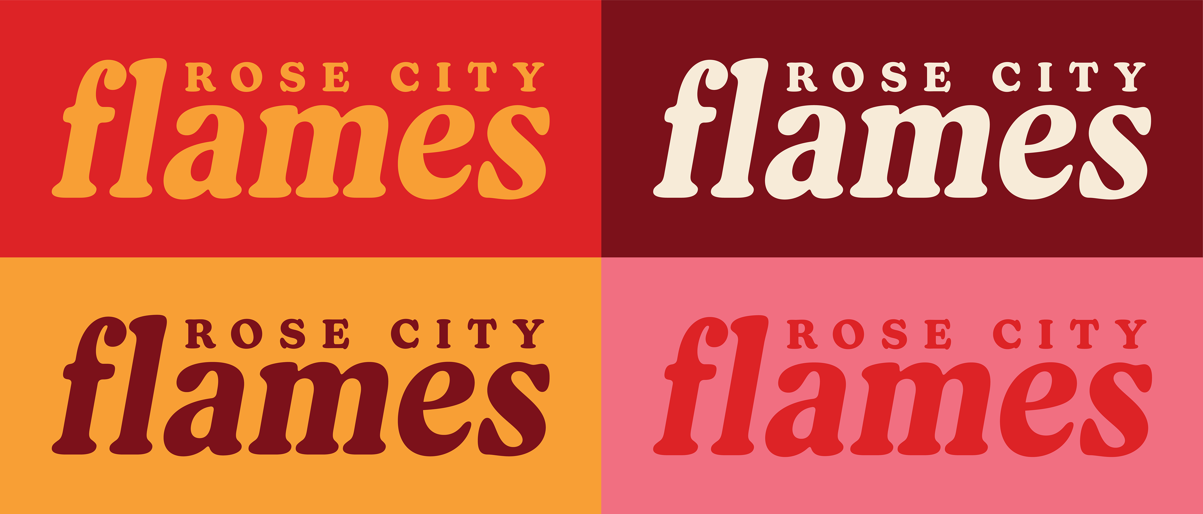
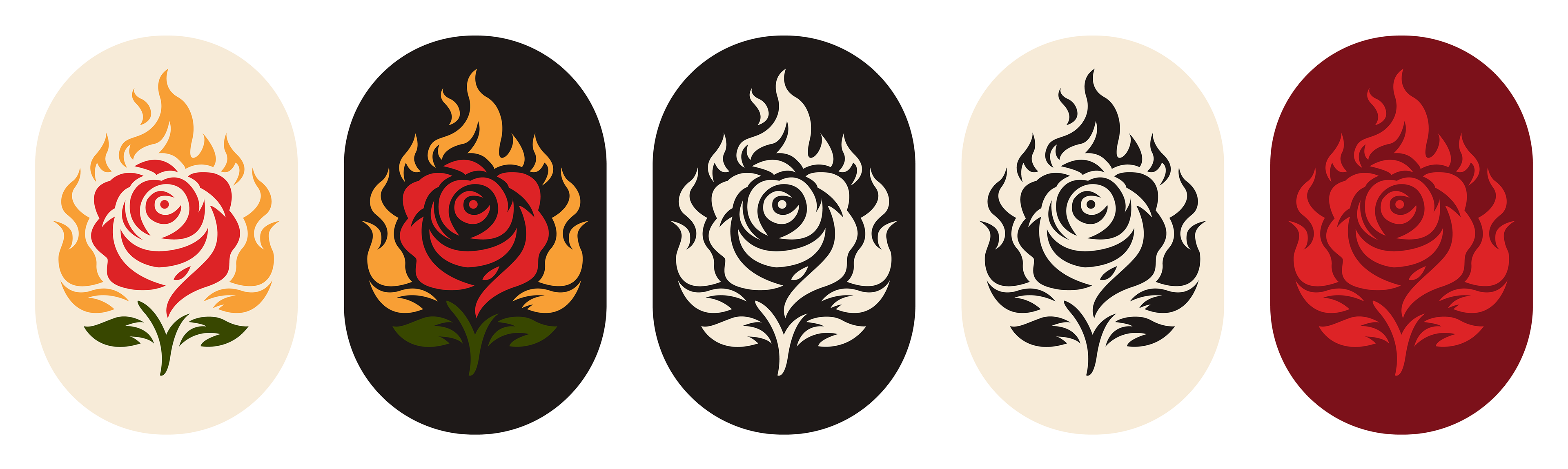
Problem: Portland lacked a visual identity for a women’s professional basketball team, especially prior to the creation and branding of the real Portland Fire. I wanted to conceptualize a team that embodied the city’s energetic spirit and heritage—the “Rose City”—through bold, feminine visual branding that felt powerful and culturally resonant.
Solution:
- I developed a concept brand identity—Rose City Flames—that captures Portland’s vitality and feminine strength. The design centers on:
- A flame-inspired emblem with flowing, rose-petal shapes that merge the city’s nickname with dynamic athletic energy.
- A bold, confident color palette, using deep reds and soft pinks to balance fierceness and femininity.
- Typographic choices that are modern, assertive, and legible across merchandise and promotional materials.
Outcome: Rose City Flames serves as a compelling exercise in brand identity for a hypothetical Portland women’s basketball team—completely speculative and predating the real Portland Fire. The designs highlight my ability to blend local culture, feminist energy, and sports branding into a visually memorable package.