
BRAND EVOLUTION:
The Oregon Child & Family Center for Excellence partnered with me to develop a refreshed visual identity that better represented their evolving mission and strengthened their connection to The Oregon Alliance. The goal was to create a mark that felt modern, flexible, and aligned with the larger Oregon Alliance brand system while still giving the Center its own distinct identity.
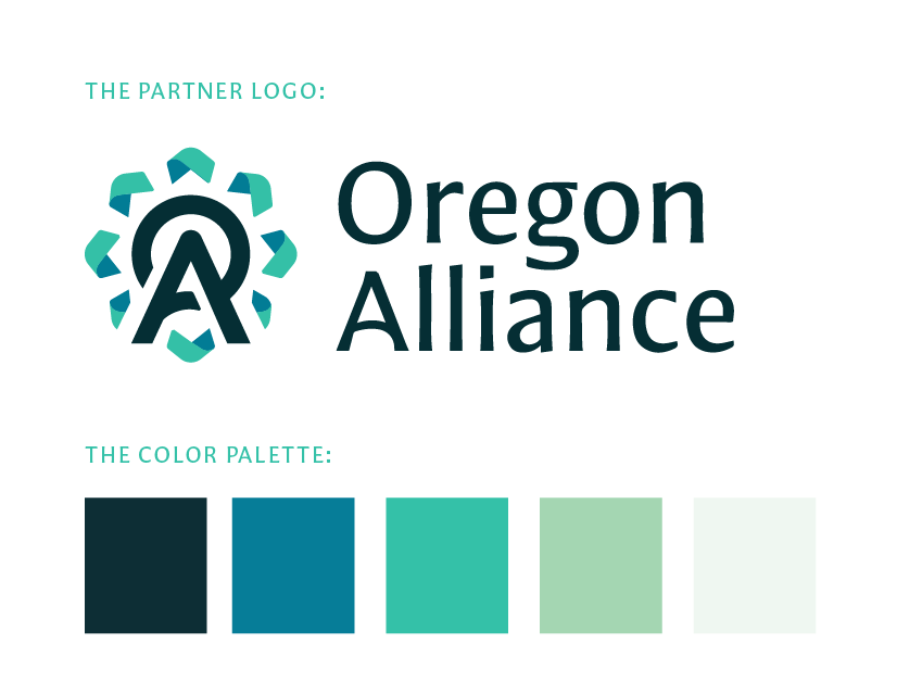
A key goal of the redesign was creating a mark that felt connected to The Oregon Alliance’s recently refreshed brand system. The new identity needed to share typography and color language while maintaining a distinct personality for the Center for Excellence.

CONCEPT EXPLORATION:
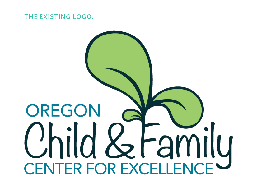
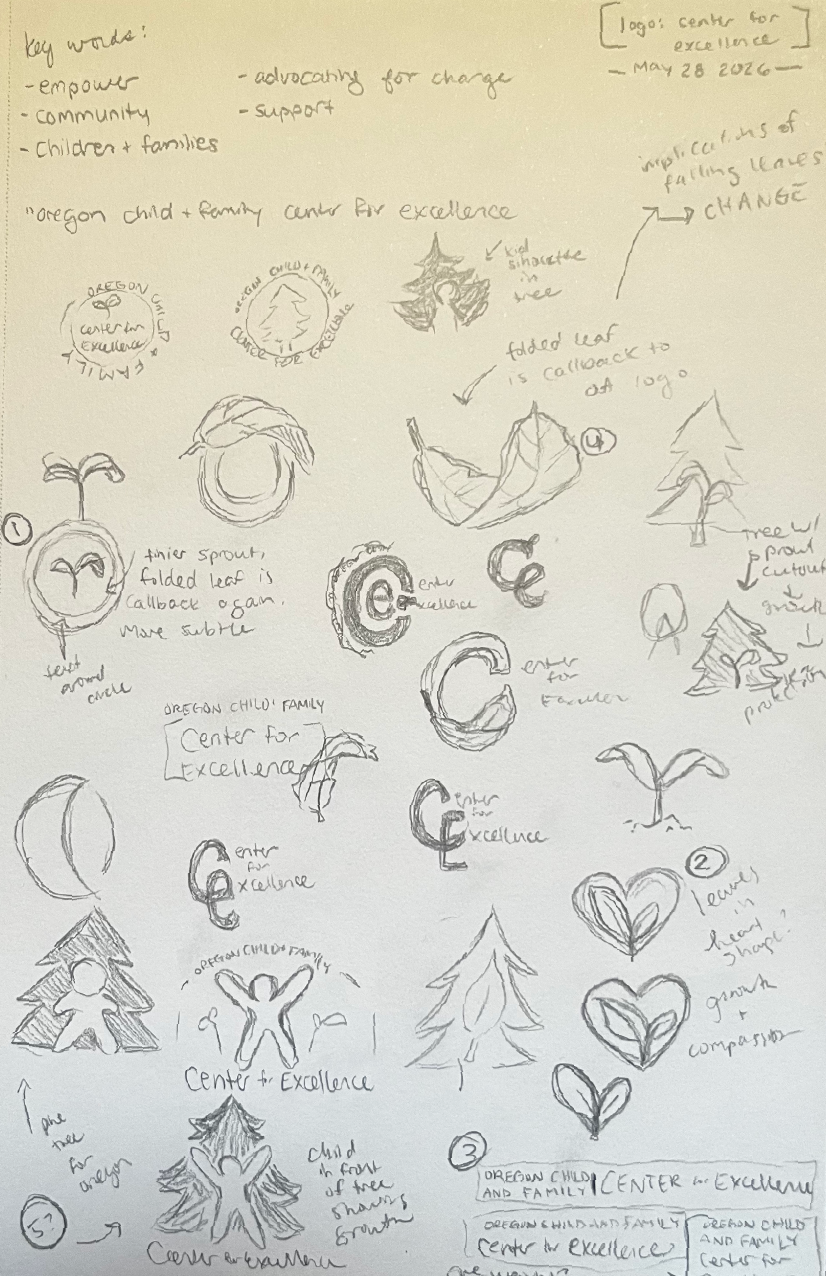
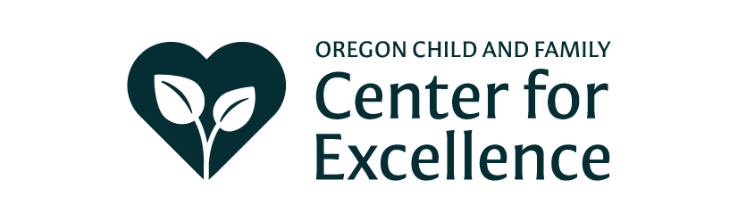
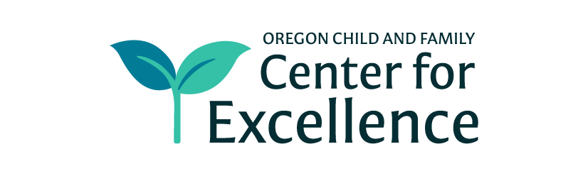
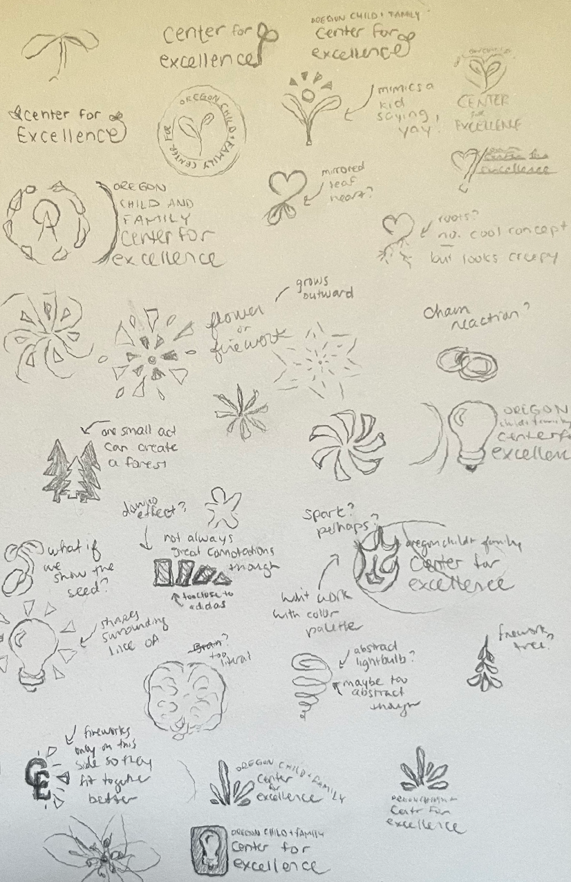
Initial exploration focused on themes of growth, connection, and learning — including refinements of the existing sprout concept, Oregon-inspired natural elements, and typographic solutions. Through collaboration with leadership, we identified that the strongest direction was not simply modernizing the existing symbol, but developing a new visual language that better represented the organization’s purpose.

REFINING THE DIRECTION:



FINDING THE CORE CONCEPT:
After reviewing the initial concepts with the CEO and key stakeholders, we identified that the challenge extended beyond modernizing the existing sprout mark — the organization wanted to move away from the sprout symbol entirely. While the monogram direction came closest, it still did not fully capture the Center for Excellence’s mission and personality.
Further exploration focused on broader themes of growth, learning, and inspiration, including trees, light, and sparks. While these concepts aligned with the organization’s values, they felt too literal. The strongest direction emerged from looking beyond the individual symbols and identifying the shared idea behind them: upward and outward growth.
KEY INSIGHT:
Across the exploration process, a recurring visual pattern appeared — movement radiating from a central point. This became a metaphor for the Center for Excellence itself: a place where curiosity begins, knowledge grows, and support extends outward into the community. The final concept transforms that idea into a subtle but meaningful visual system that communicates growth, momentum, and connection.


DEVELOPING THE FINAL IDENTITY:
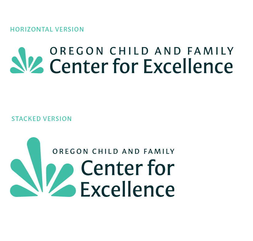
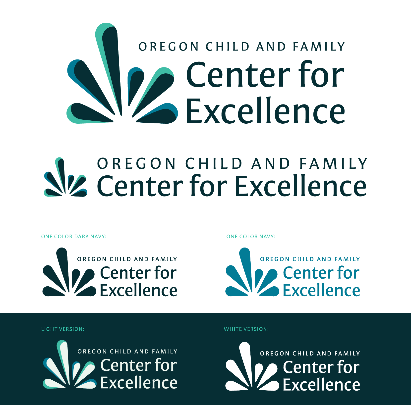
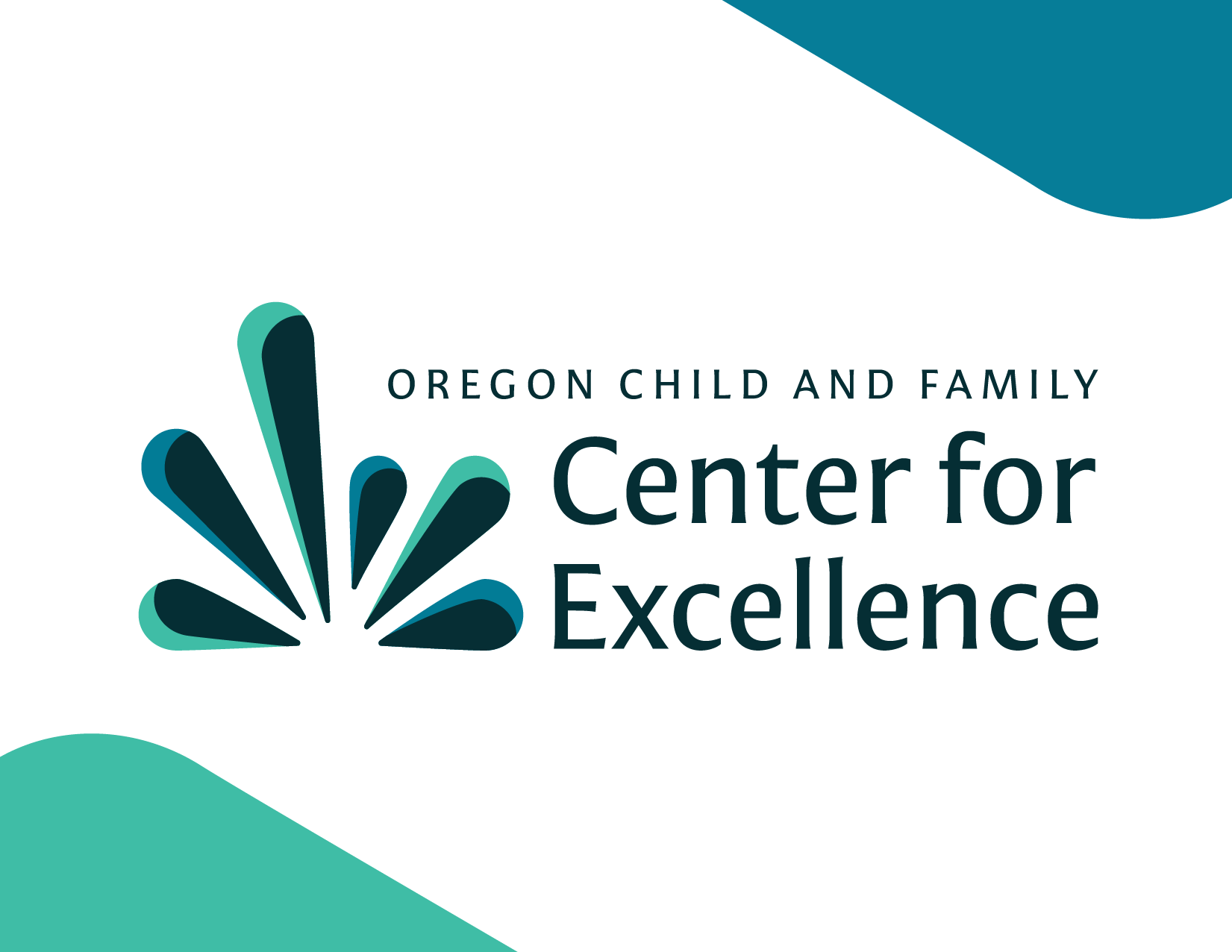
This mark uses an upward and outward movement pattern to represent growth, confidence, and possibility. Each element begins at a shared origin point and expands outward, reflecting the Center for Excellence’s role as a foundation for growth, learning, and collective impact.
The varied lengths of each element represent the idea that individuals and communities grow at different paces while moving toward shared goals. The result is a mark that feels energetic and optimistic while maintaining a clean, flexible visual language that complements The Oregon Alliance brand.
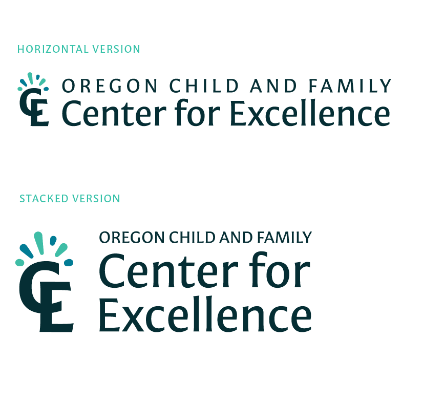
A secondary monogram direction explored how the growth concept could integrate more subtly into the existing brand system. This version reduced the weight of the original circular structure, creating a lighter and more curious expression while maintaining a visual relationship with The Oregon Alliance “OA” mark.
The growth element became a small but intentional detail — a nod to curiosity, discovery, and the celebration of knowledge at the heart of the Center for Excellence’s work.
The first growth-based concept became the clear direction moving forward. Through several rounds of refinement, we adjusted color, shape, and balance to ensure the final mark felt cohesive alongside The Oregon Alliance brand while maintaining its own distinct identity.

THE FINAL SOLUTION: